Friday, 6 April 2012

Post Production Feedback

Front Cover Feedback.
Weaknesses: Some people found some fonts on the front cover a little hard to read. For example some found it confused as what the website link said. This may have been because of the shade of dark red contrasting with the darkish background. Other problems the audience had with the page was the alignment of cover lines. This was probably because rather than keeping the masthead in line with the cover lines, it expanded to either end of the page, where the cover lines remained in alignment.
Strengths: The strength here lay in the co-ordination of colours and arrangement. For example having the box behind the main cover line moderately transparent so as not to detract from the image but still imitate the transparency and colour of the micro-phone and the micro-phone stand. The cover lines where attractive as well. This was because I placed some in the middle-ground of the image, and some in the foreground to outline the importance of them.


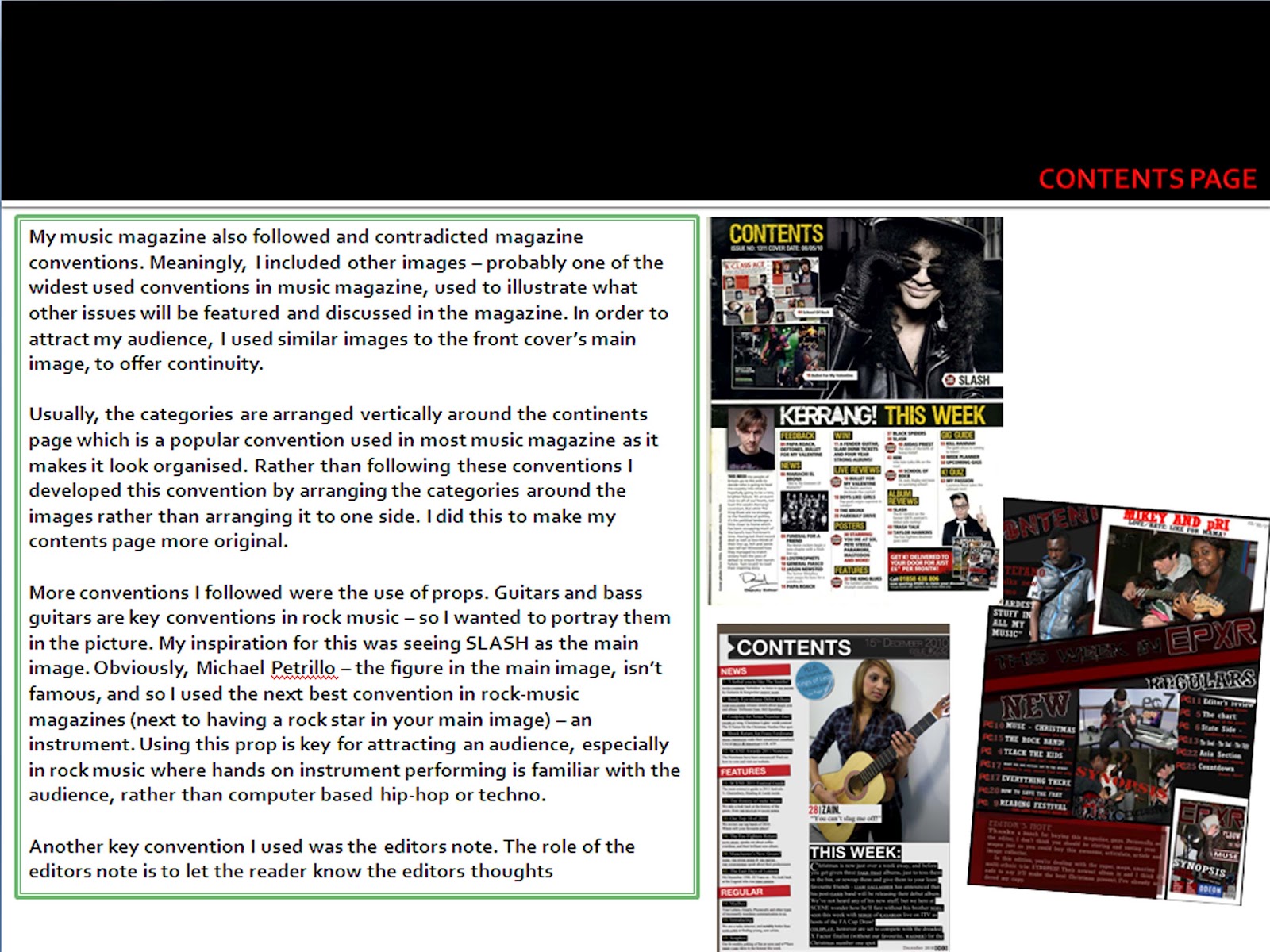
Contents Page Feedback.
Weaknesses: The main problems was the focus of the image. It was said that the fonts such as 'This week in' and 'making music' were unclear. The reason behind this is that they both shared the same fonts as the Masthead on the front cover. Another sight problem is that the information underneath the subheadings with unreadable, because of the poor JPEG quality. An unshared problem, however was about the rotation of the images. In the same fashion the text in the DPS is slanted as well as the Synopsis pictures on contents page, it was asked that the text on the contents page would be slanted in the same fashion and it would look better than what it is.
Strengths: The colour scheme was all the rage here. The readers were a fan of its simplicity. The general colour scheme of the image and the fonts were liked by the readers. This is because of the continuity between the front cover and this current page. Another strength lay in the originality of the contents page layout, for some readers. The originality came from a scattered-photos-on-a-table inspiration.

Double Page Spread Feedback.
Weaknesses: The opinions were quite contrasting here. Some weren't fans of the collage effect of the photos. This was because some readers don't want to have things too complex. The photos on the 1st column left some readers confused.
Strengths: For others, the overlapping pictures was quite liked. Ideally, this was because some did NOT like it, so some had to. But specifically, it gave the readers a sense of familiarity due to the scattered-photos-on-a-table effect. Other strengths were in the colour scheme. It's liked because it still offers this continuity and simplicity. One even liked how the contrast between red, white and black didn't draw an impression it being ruined. This was because the colour schemes were designed to be sharp and eye catching and as to mirror the colours of the instruments used.

Friday, 9 March 2012

The Final Products


The Mood Board.


Main: Double page spread - Conventions Diagram + Textual analysis


The left column of the DPS (which holds a bold banner holding the word NEWS which may be suggesting the importance of the article), as this one does, almost always holds the subject image of the article conventionally placed on the right hand column. 


The big writing owned by the headline captures the eye of the audience which is especially useful if the audience is simply 'flicking through' the magazine. The colours of the headline and of the colour scheme could be representing the glamour of a rock star and done in order to appeal to the target audience (probably a rock audience). The border of the DPS seem to support this as they appear to be lights seen at a stereotypical celebrity's make up table before they walk on stage to perform.


The article is in question and answer form which may be representing an interview. I was wrong to say that their were no quotes in the article. The quotes are the answers, but a noticeable quotes is the headline itself. It reads: "Do I ever have a casual friday? Absolutely!". This offers a strong sense of familiarity to the target audience as this audience - rather than being office workers who are always dressed in tidy suits - would tend to be always dressed casually like Havok is in the image above. The headline shows the audience that Havok will be talking about celebrity culture and his style which is related to what the quote connotes: that he is never uptight, and always laid back and casual.


The lighting is very high key which is a must in magazine images (unless to create an effect such as mysteriousness). 


His clothes and jewellery, in relation to the headline and other aspects of the DPS already mentioned, could be connoting his casual characteristics. The t-shirt sleeves are short, perhaps to draw attention to his tattoos, an image certain aspects of the rock audience can be familiar with. In connection with his clothing, he is standing a little relaxed, in an almost nonchalant fashion possibly suggesting that there is a certain element of being laid back, which can be supported in the calm, blank facial expression he's wearing.

Main: Contents page - Conventions diagrams


Friday, 2 March 2012

Main: Audience Profile

Audience Profile

The EXPR READERs: Chris, 18, is an aspiring musician, who’s life is led solely by music: it leads his life – fashion, hobbies, ‘girlfriends’, and just general living style. His alarm clock is Muse – Falling down, and rocks out with Rage Against The Machine. When he’s not jammin’ on his guitar with his friends, he’s listening to his favourite albums and his Dad’s records: The Police and RadioHead make for a good combination of music. He loves going to gigs with his mates, or just chillin’ out at a festival. He enjoys his youth, studies well, and is always up for new things: New music, new styles, new creations…
Like most teenagers, he dreams about being on stage and blowing people’s minds, but occasionally he’s down to earth. His ‘go-getter’ life style, in his music and fashion really communicates ‘his identity’ as a young adult to everyone around him.

Milena, 17, is at Reading and Glastonbury EVERY festival - she never misses one. She's a sucker for bass players, crazy about Trivium and Escape the Fate (as she has all their albums from Ascendancy to This War Is Ours) and is head-over-heals for her band member boyfriend.
 Her fashion? Black make up, black hair, black clothes; BLACK EVERYTHING. Her favourite band? The Lost Prophets. Favourite singer? Haley Williams. She isn't goth nor emo, but she's definately A ROCK CHIC.

Rick, 20, is a student who hasn't a care in the world.
Except for music - but then again, what can he say? He's passionate about it. Yeah, he misses a lecture - sometimes not his fault, sometime his fault: he can't help it when he blasting The Eagles - Hotel California out of his campus window. His roommate doesn't mind either; they do nothing but listen to Eric Clapton all day. He's a talented multi-instrumentalist and listens to everything from Coldplay - High Speed to Handel - And the Glory of the Lord. He loves life, as he loves music - rock, pop, Dire Staits, Spice Girls, baroque, modern era, Bach, Schoenberg, and it just goes on and on and on..
Fashion is always changing for him - hair styles are different every week. Converses one day and Doc Martins another. It's the only way he can really communicate his identity to the world. An identity most young guys and girls need, and that is portrayed in EXPR: openness to music.

Friday, 13 January 2012

Main: Audience Research

Musicmagg Questionnaire.

Example Question –
How awesome are you? (erase answer): Just Awesome| Super Awesome| Hyper Mega Awesome| Poop|

(Me answering the question) - Example Question –
How awesome are you? (erase answer): Just Awesome| Super Awesome| Hyper Mega Awesome|

Which one was my answer? The answer that’s missing. Yes, it was poop. I’m poop. Now answer my questions.

__________________________________________________________________________________
Asked 30 – chain email.

Age (erase answer): 16 – 20|21 – 25|25 – 30|// (20: 16 – 20) (10: 21 – 25) (0:25 – 30)

Gender (erase answer): Female| Male| (16: Male) (14:female)


Name your favourite 4 artists/groups and what genre would you call their music (separate with comas)
E.g. Trololo, Nyan cat, Muse, Brittany Spears): (27: Muse) (19: The Fray) (17: Adele) (14: LMFAO)

What d’you wanna see in our magazines? (cross off as many as you like): Reviews| Gig commentaries| competitions| latest music| Posters| adverts| Artist articles| celebrity gossip|

(Mainly all selected)

What is your favourite music magazine?

…………………………………………………………. (Mainly NME/Kerrang)

What name do you prefer the most?
a)      ‘N Roll (1)
b)      Shift (1)
c)       EXPR (24)
d)      Play More (2)
e)      Riff (3)

Favourite colour scheme on Email: Red + Black