
Friday, 9 March 2012

Main: Double page spread - Conventions Diagram + Textual analysis

The left column of the DPS (which holds a bold banner holding the word NEWS which may be suggesting the importance of the article), as this one does, almost always holds the subject image of the article conventionally placed on the right hand column.
The big writing owned by the headline captures the eye of the audience which is especially useful if the audience is simply 'flicking through' the magazine. The colours of the headline and of the colour scheme could be representing the glamour of a rock star and done in order to appeal to the target audience (probably a rock audience). The border of the DPS seem to support this as they appear to be lights seen at a stereotypical celebrity's make up table before they walk on stage to perform.
The article is in question and answer form which may be representing an interview. I was wrong to say that their were no quotes in the article. The quotes are the answers, but a noticeable quotes is the headline itself. It reads: "Do I ever have a casual friday? Absolutely!". This offers a strong sense of familiarity to the target audience as this audience - rather than being office workers who are always dressed in tidy suits - would tend to be always dressed casually like Havok is in the image above. The headline shows the audience that Havok will be talking about celebrity culture and his style which is related to what the quote connotes: that he is never uptight, and always laid back and casual.
The lighting is very high key which is a must in magazine images (unless to create an effect such as mysteriousness).
His clothes and jewellery, in relation to the headline and other aspects of the DPS already mentioned, could be connoting his casual characteristics. The t-shirt sleeves are short, perhaps to draw attention to his tattoos, an image certain aspects of the rock audience can be familiar with. In connection with his clothing, he is standing a little relaxed, in an almost nonchalant fashion possibly suggesting that there is a certain element of being laid back, which can be supported in the calm, blank facial expression he's wearing.

Friday, 2 March 2012
Main: Audience Profile
Audience Profile
The EXPR READERs: Chris, 18, is an aspiring musician, who’s life is led solely by music: it leads his life – fashion, hobbies, ‘girlfriends’, and just general living style. His alarm clock is Muse – Falling down, and rocks out with Rage Against The Machine. When he’s not jammin’ on his guitar with his friends, he’s listening to his favourite albums and his Dad’s records: The Police and RadioHead make for a good combination of music. He loves going to gigs with his mates, or just chillin’ out at a festival. He enjoys his youth, studies well, and is always up for new things: New music, new styles, new creations…
Like most teenagers, he dreams about being on stage and blowing people’s minds, but occasionally he’s down to earth. His ‘go-getter’ life style, in his music and fashion really communicates ‘his identity’ as a young adult to everyone around him.
Milena, 17, is at Reading and Glastonbury EVERY festival - she never misses one. She's a sucker for bass players, crazy about Trivium and Escape the Fate (as she has all their albums from Ascendancy to This War Is Ours) and is head-over-heals for her band member boyfriend.
Her fashion? Black make up, black hair, black clothes; BLACK EVERYTHING. Her favourite band? The Lost Prophets. Favourite singer? Haley Williams. She isn't goth nor emo, but she's definately A ROCK CHIC.
Rick, 20, is a student who hasn't a care in the world.
Except for music - but then again, what can he say? He's passionate about it. Yeah, he misses a lecture - sometimes not his fault, sometime his fault: he can't help it when he blasting The Eagles - Hotel California out of his campus window. His roommate doesn't mind either; they do nothing but listen to Eric Clapton all day. He's a talented multi-instrumentalist and listens to everything from Coldplay - High Speed to Handel - And the Glory of the Lord. He loves life, as he loves music - rock, pop, Dire Staits, Spice Girls, baroque, modern era, Bach, Schoenberg, and it just goes on and on and on..
Fashion is always changing for him - hair styles are different every week. Converses one day and Doc Martins another. It's the only way he can really communicate his identity to the world. An identity most young guys and girls need, and that is portrayed in EXPR: openness to music.
Milena, 17, is at Reading and Glastonbury EVERY festival - she never misses one. She's a sucker for bass players, crazy about Trivium and Escape the Fate (as she has all their albums from Ascendancy to This War Is Ours) and is head-over-heals for her band member boyfriend.
Her fashion? Black make up, black hair, black clothes; BLACK EVERYTHING. Her favourite band? The Lost Prophets. Favourite singer? Haley Williams. She isn't goth nor emo, but she's definately A ROCK CHIC.
Rick, 20, is a student who hasn't a care in the world.
Except for music - but then again, what can he say? He's passionate about it. Yeah, he misses a lecture - sometimes not his fault, sometime his fault: he can't help it when he blasting The Eagles - Hotel California out of his campus window. His roommate doesn't mind either; they do nothing but listen to Eric Clapton all day. He's a talented multi-instrumentalist and listens to everything from Coldplay - High Speed to Handel - And the Glory of the Lord. He loves life, as he loves music - rock, pop, Dire Staits, Spice Girls, baroque, modern era, Bach, Schoenberg, and it just goes on and on and on..
Fashion is always changing for him - hair styles are different every week. Converses one day and Doc Martins another. It's the only way he can really communicate his identity to the world. An identity most young guys and girls need, and that is portrayed in EXPR: openness to music.
Friday, 13 January 2012
Main: Audience Research
Musicmagg Questionnaire.
Example Question –
How awesome are you? (erase answer): Just Awesome| Super Awesome| Hyper Mega Awesome| Poop|
(Me answering the question) - Example Question –
How awesome are you? (erase answer): Just Awesome| Super Awesome| Hyper Mega Awesome|
Which one was my answer? The answer that’s missing. Yes, it was poop. I’m poop. Now answer my questions.
__________________________________________________________________________________
Asked 30 – chain email.
Age (erase answer): 16 – 20|21 – 25|25 – 30|// (20: 16 – 20) (10: 21 – 25) (0:25 – 30)
Gender (erase answer): Female| Male| (16: Male) (14:female)
Name your favourite 4 artists/groups and what genre would you call their music (separate with comas)
E.g. Trololo, Nyan cat, Muse, Brittany Spears): (27: Muse) (19: The Fray) (17: Adele) (14: LMFAO)
What d’you wanna see in our magazines? (cross off as many as you like): Reviews| Gig commentaries| competitions| latest music| Posters| adverts| Artist articles| celebrity gossip|
(Mainly all selected)
What is your favourite music magazine?
…………………………………………………………. (Mainly NME/Kerrang)
What name do you prefer the most?
a) ‘N Roll (1)
b) Shift (1)
c) EXPR (24)
d) Play More (2)
e) Riff (3)
Favourite colour scheme on Email: Red + Black
Friday, 16 December 2011
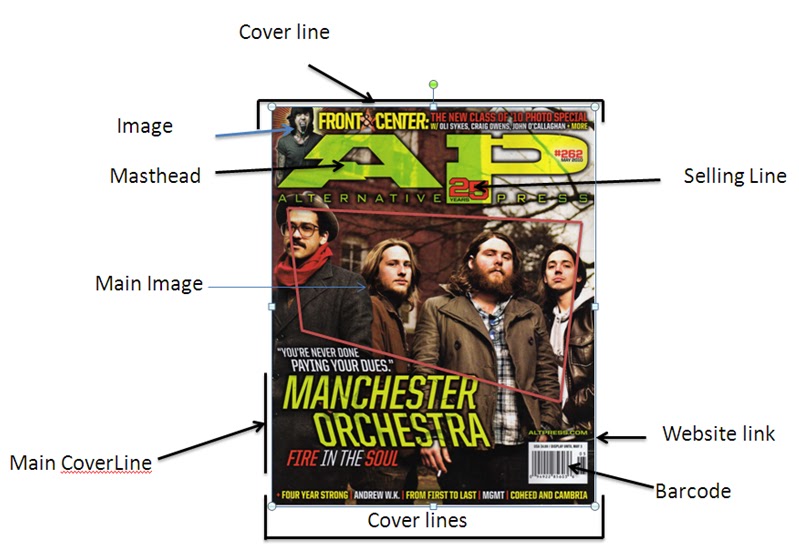
Main: Front Cover Textual analysis & convention diagram
`The selling line, ’25 years’ can connote that the magazine have experience and so could be used to draw in readers, almost to say the they can ‘trust’ the magazine. The ‘25’ in the ’25 years colour’ supports this point: it could be implying that 25 years in experience is important. Teenagers and young adults want to be updated on the latest music, and so its experience is almost inviting them in to the magazine. The name of the magazine, placed beneath the A and the P, reads Alternative Press, showing its uniqueness or originality to any other magazine of it genre. In a way, as I said before, it is a little unique. The masthead for Alternative Press is placed in front of the main image after all, which isn’t supporting the stereotypes of this genre. The main coverline that reads 'Manchester Orchestra' was edited so each word would mirror each other
The main cover line: Manchester Orchestra, who are the main features of this edition of the magazine, as their image has been printed on the front cover. It could be suggesting their importance to the other cover lines. It says, between quotation marks, above the main cover line “You’re never done paying your dues”. Why would they say that, the readers would ask? What where they talking about? The readers would have to look in to answer their own questions. What would draw them in further is a hint to their answers; it reads below the main coverline: “fire in the soul” with the “fire” and “soul” printed in red, contrasting the white “in the”. This sounds and looks quite passionate to the reader.
In the image, they (Manchester Orchestra) are all dressed quite casually. I.e. shirts, jackets, hoodies and even a brown pork pie hat. It shows their confidence and comfort. This is supported by the low angle shot looking up at them, and capturing the blurred building behind as if to show that they themselves are towering and high up, representing their abilities to the readers. Andy Hull, the lead singer, is holding a cigarette (or what seems to be a cigarette). This connotes maturity, and would relate to an audience of their age (20-25), but could also relate to older teenage characters. Their NVC also connotes confidence, as they seem to be looking down at the readers. Again, this is supported by the low angle shot.
Thursday, 8 December 2011
Main: IPC MEDIA Case study

CASE
STUDY
IPC MEDIA is the UK's
leading magazine publisher above companies such as UKMAG. IPC MEDIA
publish, among other magazines in their men's division (IPC Inspire) such as lad's mag. NUT are NME.
IPC MEDIA produce over 60 iconic brands with print alone (magazines such as MARIE CLAIRE in the 'up-market women's division of IPC MEDIA and other prints such as WORLD SOCCER) that reach about a third of UK women, and almost half of all UK men.
They don't only target audiences with their printed brands, but also with their digital brands. Where VOLKS WORLD magazine's target audience would generally be strong fans of the Volkswagen vehicle brand, found in the mass market men's portfolio next to NUT and NME is a website called MOUSEBREAKER. MARIE-CLAIRE's target audience is the middle aged women, and PICK ME UP (a gossip magazine under the mass market woman's portfolio of IPC: IPC Connect) would target mainly an upper class female audience/an audience varying from a teen age to mid-50s who belong to the working class but MOUSEBREAKER targets a male audience from teenagers to those younger than adolescence.
IPC also offer various niche magazines. For example sailing magazines such as BOAT OWNER and YACHTING WORLD that would target sailing fans and business men of various adult ages. Or magazines targeted at mothers and housewives such as WOMAN&HOME and WOMAN'S WEEKLY that hold cover lines such as 'my diet warning to my daughter' and articles on food recipes. Other aspects of their wide range of brands are sports magazines - which can be even more finely broken down into specific target audiences. For example MBR (Mountain bike rider) would be targeted at a mainly male teen to young adult (18-25) target audience who are fans of this style of sport. Another example could be the target audience of HORSE AND HOUND - a world known equestrian magazine (magazine for those who do work with horses) - which is those who usually live outside of the cities and in the country who are involved with horse riding or breeding etc.
The point is that IPC MEDIA, within its three portfolios (IPC Inspire - male division, IPC Connect - mass market woman's division and IPC Southbank - upper market woman's division), generate a figure of over 3.5 million readers who read IPC MEDIA products a week.
IPC really couldn't have generated such a figure if they hadn't been aiming at such a varied number of target audiences. This is the general reason why it targets a different audience with each magazine it makes. Although a lot of IPC MEDIA's magazines appear similar, in all realities they are actually targeted at small differences in the audience. For example, under IPC Connect, there is the gossip magazine CHAT and there is CHAT - IT'S FATE which is an edition of the magazine that not only covers gossip but horoscopes and mind reading and so plays on the fact that this target audience will believe what they read. The difference in targeting lies within that fact that some of CHAT's target audience will and won't be fans of this edition.
The main reason as to why it targets different audiences with each magazine is to make more money because targeting less audiences than IPC's competitors such as MUSICMAGS or UKMAG will put the company down. The way these companies make more and more money is by tapping into audiences that have not been represented or worked for.
IPC MEDIA is a subsidiary company of TIME.INC who are, in turn, a subsidiary company of TIME WARNER who's parent division is WARNER BROS. ENTERTAINMENT who cover music, television and film. This is another reason as to why IPC MEDIA targets different audiences with each different magazine. It helps create a more complex cross media convergence.
IPC also offer various niche magazines. For example sailing magazines such as BOAT OWNER and YACHTING WORLD that would target sailing fans and business men of various adult ages. Or magazines targeted at mothers and housewives such as WOMAN&HOME and WOMAN'S WEEKLY that hold cover lines such as 'my diet warning to my daughter' and articles on food recipes. Other aspects of their wide range of brands are sports magazines - which can be even more finely broken down into specific target audiences. For example MBR (Mountain bike rider) would be targeted at a mainly male teen to young adult (18-25) target audience who are fans of this style of sport. Another example could be the target audience of HORSE AND HOUND - a world known equestrian magazine (magazine for those who do work with horses) - which is those who usually live outside of the cities and in the country who are involved with horse riding or breeding etc.
The point is that IPC MEDIA, within its three portfolios (IPC Inspire - male division, IPC Connect - mass market woman's division and IPC Southbank - upper market woman's division), generate a figure of over 3.5 million readers who read IPC MEDIA products a week.
IPC really couldn't have generated such a figure if they hadn't been aiming at such a varied number of target audiences. This is the general reason why it targets a different audience with each magazine it makes. Although a lot of IPC MEDIA's magazines appear similar, in all realities they are actually targeted at small differences in the audience. For example, under IPC Connect, there is the gossip magazine CHAT and there is CHAT - IT'S FATE which is an edition of the magazine that not only covers gossip but horoscopes and mind reading and so plays on the fact that this target audience will believe what they read. The difference in targeting lies within that fact that some of CHAT's target audience will and won't be fans of this edition.
The main reason as to why it targets different audiences with each magazine is to make more money because targeting less audiences than IPC's competitors such as MUSICMAGS or UKMAG will put the company down. The way these companies make more and more money is by tapping into audiences that have not been represented or worked for.
IPC MEDIA is a subsidiary company of TIME.INC who are, in turn, a subsidiary company of TIME WARNER who's parent division is WARNER BROS. ENTERTAINMENT who cover music, television and film. This is another reason as to why IPC MEDIA targets different audiences with each different magazine. It helps create a more complex cross media convergence.
Subscribe to:
Posts (Atom)